Taking TripIt global with an illustration-led rebrand
A rebrand that moved TripIt from feature lists and screenshots to an illustration system built for travelers, and built to go global.
- Company
- TripIt (SAP Concur)
- Role
- Head of Brand Design
- Scope
- Brand identity
- Visual design system
- Website redesign
- App icon design
- Agency partnership

Brief
TripIt was preparing to expand into new markets, but its brand hadn’t kept pace with the product or its audience. I led a rebrand to clarify its value to travelers and create a consistent identity across marketing, product and localized experiences.
Challenge
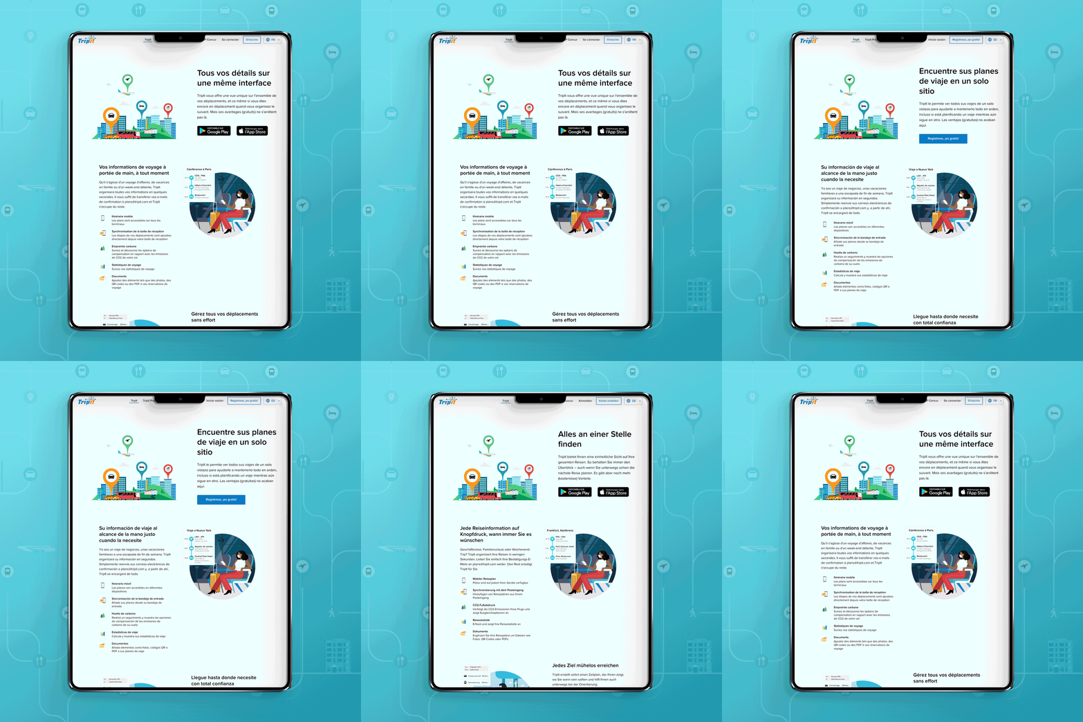
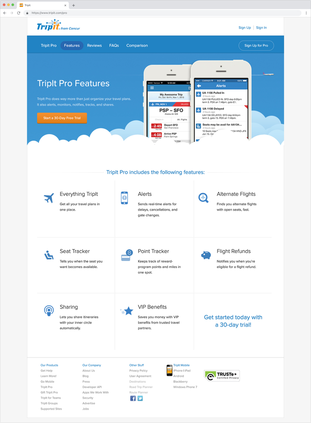
The existing brand showed people what TripIt did without making clear how it made travel easier. Marketing relied on feature lists, product screenshots and stock photography. The website wasn’t mobile-friendly, and the color palette created accessibility challenges. Global expansion added another requirement: the new identity needed to work across languages and markets without rebuilding the brand for each launch.
Solution
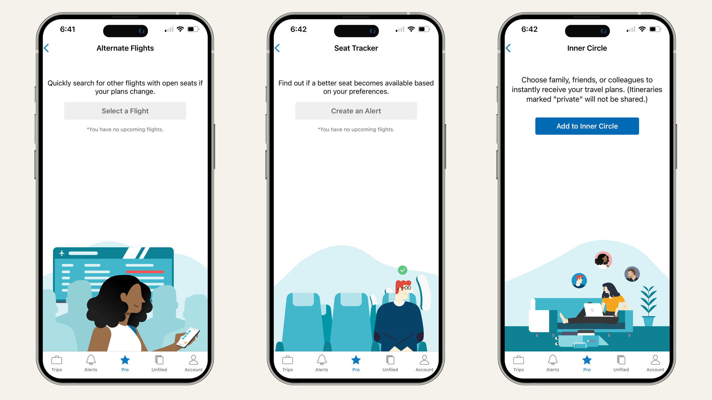
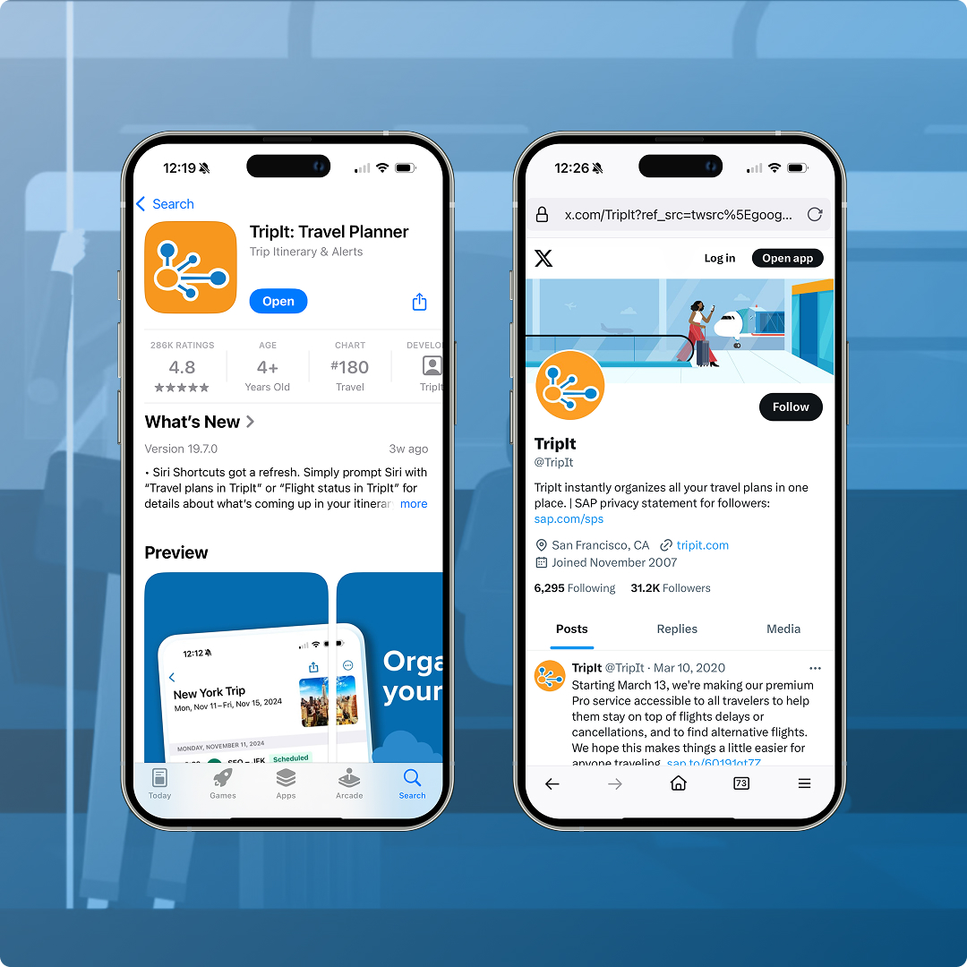
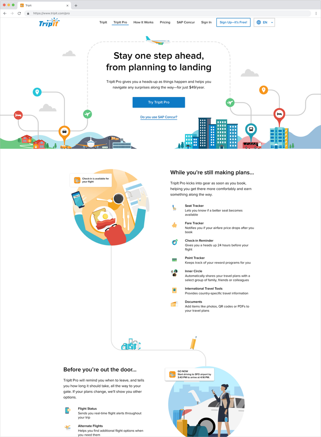
I shifted the story from product features to the traveler’s experience and built an illustration system that could carry that story across languages and markets. On the TripIt Pro page, that meant organizing the experience around the journey: before, during and after a trip. Features appeared where they were relevant, helping travelers understand their value in context. The visual identity extended across the website, marketing and product, including an app icon I designed, adapted from the logo for recognition across mobile devices and wearables.
Results
- 10% increase in overall session visits and new user signups
- Faster launches for localized websites, supported by a reusable visual system
- A flexible visual design system still in use seven years later across multiple global markets
- A redesigned app icon built for clarity across iOS, Android and wearables, still in use today