Evolving Expel's brand through change
A brand refresh that took Expel from startup-playful to enterprise-credible, shipped in releases through a stretch of constant change.
- Company
- Expel
- Role
- Creative Director
- Scope
- Brand identity refresh
- Brand audit
- Visual design system
- Brand enablement
- Front-end design
Brief
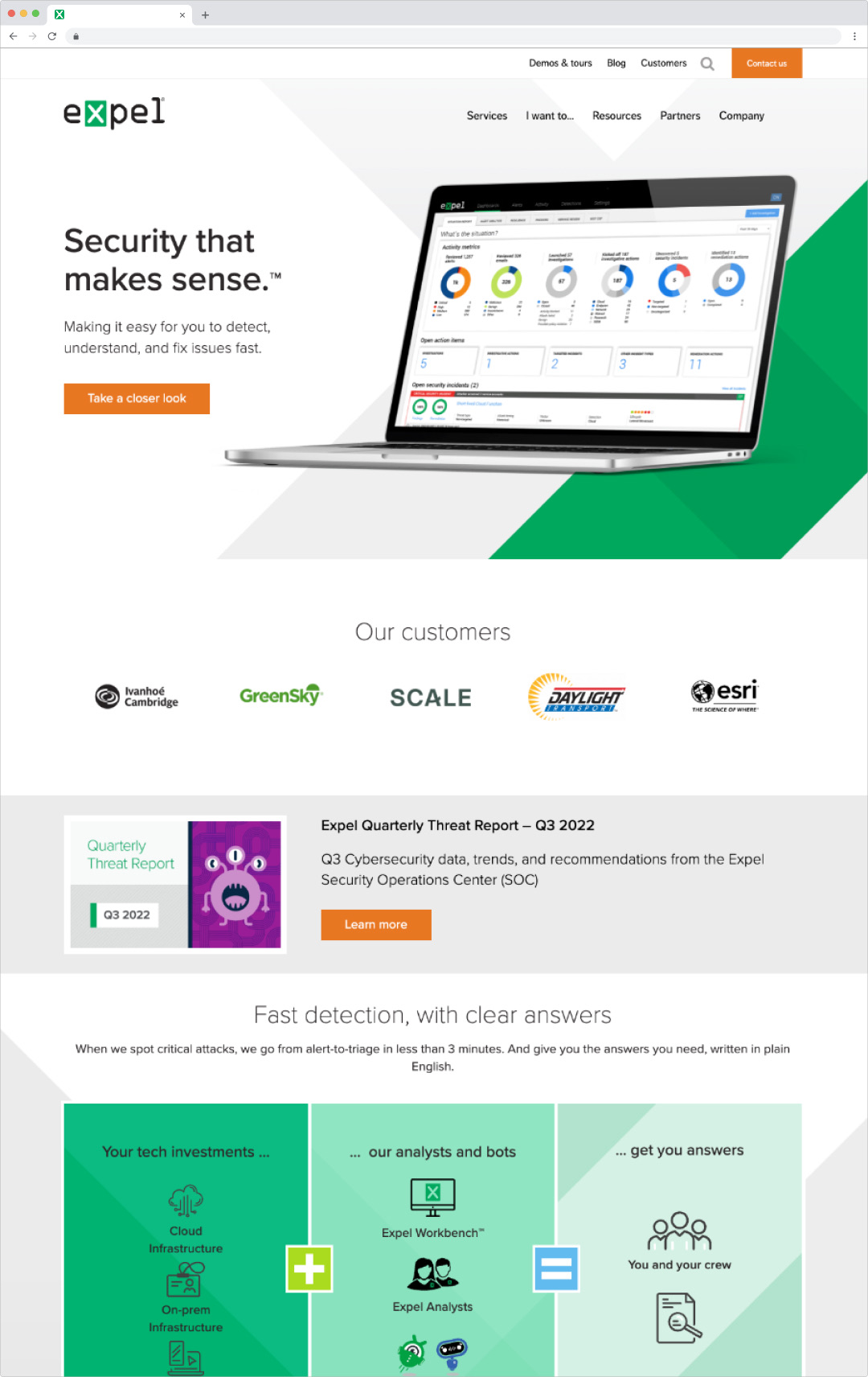
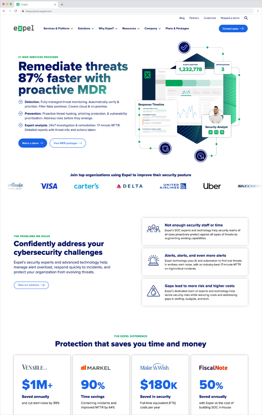
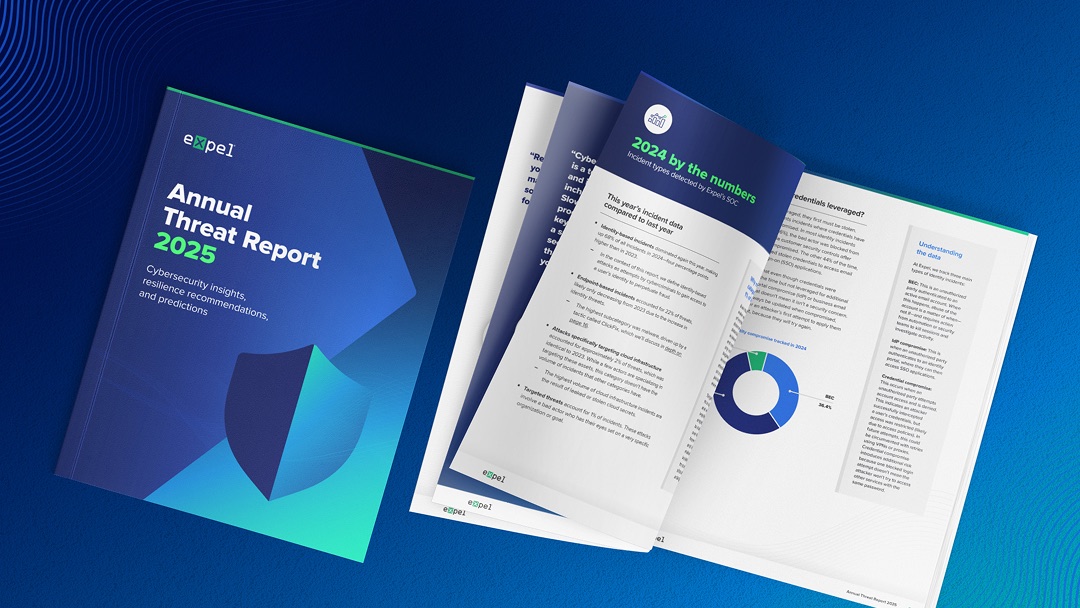
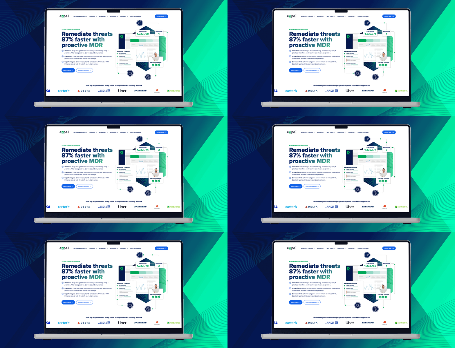
Expel had grown into a serious player in managed detection and response, but its brand still looked like the startup it used to be. With a small team, I led a refresh of the visual identity across every touchpoint, from the website and campaigns to reports and sales materials.
Challenge
The playful, irreverent style that fit Expel’s internal culture wasn’t building credibility with enterprise security leaders. Several versions of the brand were in use, and teams weren’t sure what was current. With leadership changes, reorgs and shifting priorities, there was never going to be one big launch moment.
Solution
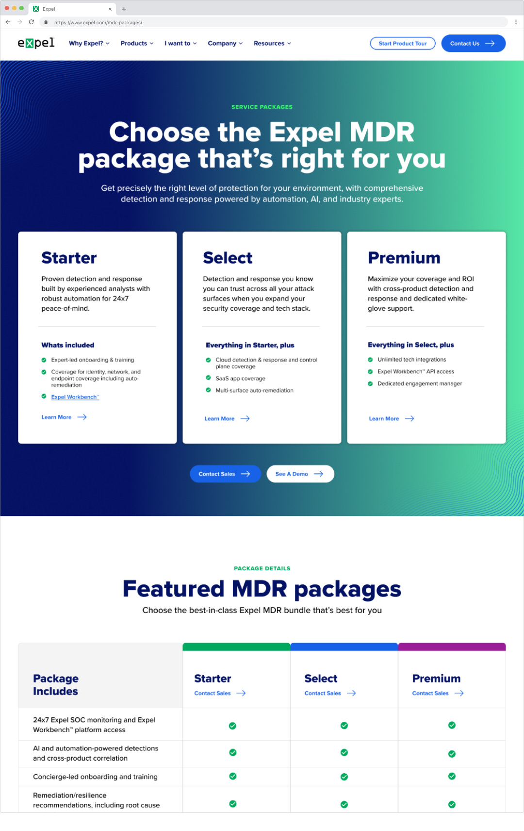
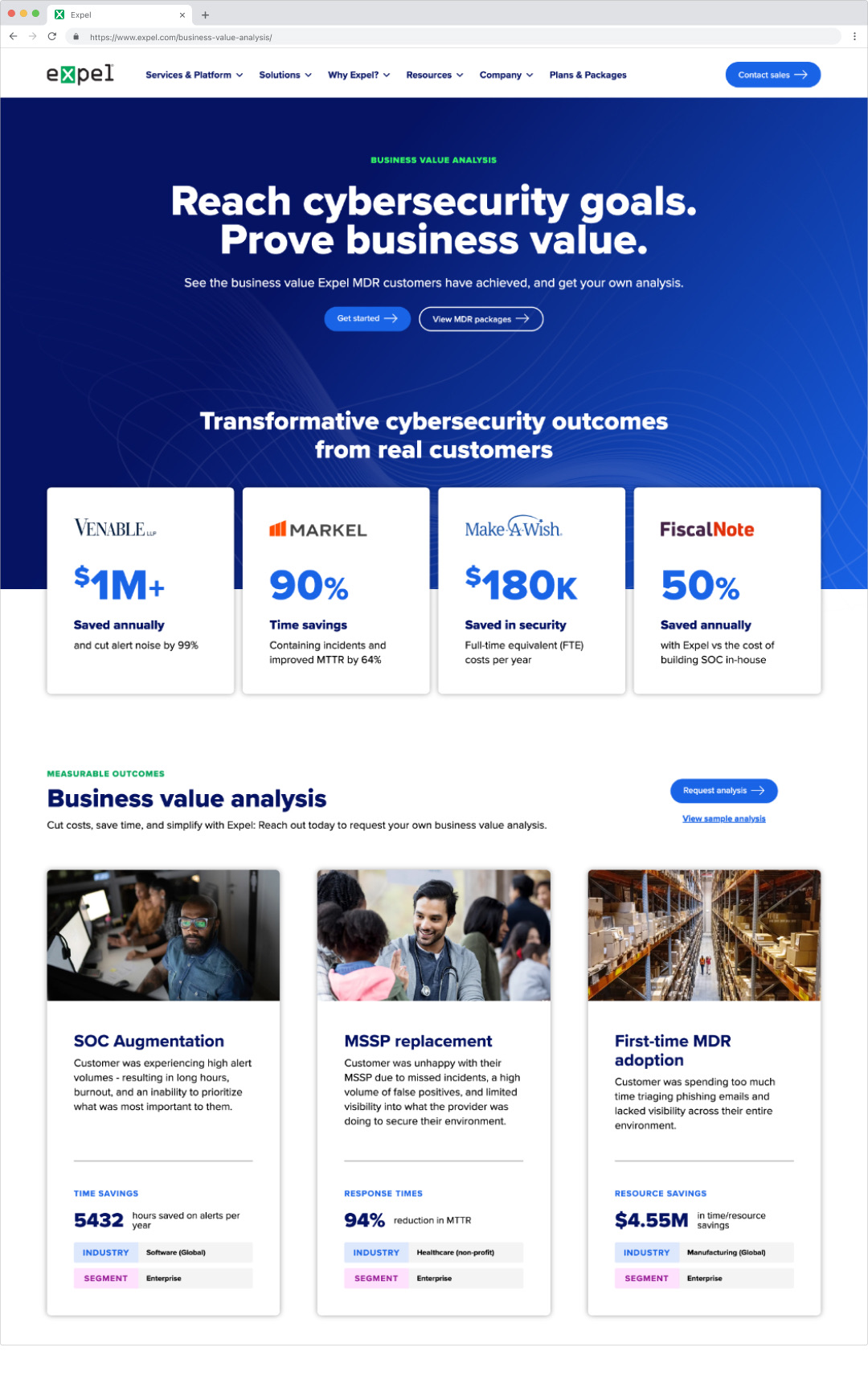
So I stopped waiting for one. I treated the brand as a living system and shipped it in releases, each one a checkpoint to test in real work and adjust. A brand audit and competitive review set the direction: a more professional system, an evolved illustration style and more intentional photography, with enough of Expel’s personality left that it still felt like Expel.
Then I made it stick. We partnered with product research to learn why past brand systems hadn’t been adopted, and built self-serve templates and a new sales deck around what marketing, sales and customer success actually needed. I designed key pages myself, including pricing and a business value page I concepted from scratch.